In today’s fast-paced business world, making informed decisions quickly can be the difference between success and failure. Business Data Visualisation Australia has emerged as a powerful tool to streamline decision-making processes, especially for Australian enterprises. Let’s dive into how you can leverage this tool to make smarter, faster decisions and stay ahead of the competition.
What is Business Data Visualisation?
Business data visualisation transforms complex data sets into clear, graphical formats like charts, graphs, and dashboards. It helps businesses identify trends, patterns, and insights that would otherwise remain hidden in spreadsheets or reports.
Why is it Important?
- Clarity: Simplifies complex information.
- Efficiency: Saves time compared to reading raw data.
- Actionable Insights: Makes it easier to spot trends.
Benefits of Data Visualisation for Australian Businesses
1. Faster Decision-Making
Visuals allow business leaders to quickly interpret data and take action. For instance, sales trends displayed in a bar graph are easier to digest than a lengthy report.
2. Improved Communication
Sharing data visually ensures everyone is on the same page. Whether you’re presenting to your team or stakeholders, visuals make your point clear and compelling.
3. Better Customer Understanding
Visualisation tools can reveal customer behavior patterns, helping Australian businesses tailor their services and products more effectively.
4. Competitive Advantage
Spotting trends before your competitors gives you an edge in the Australian market.
Top Data Visualisation Tools for Australian Businesses
Leading Tools to Consider
1. Tableau
Widely regarded for its intuitive interface and powerful features, Tableau helps businesses create stunning visual dashboards.
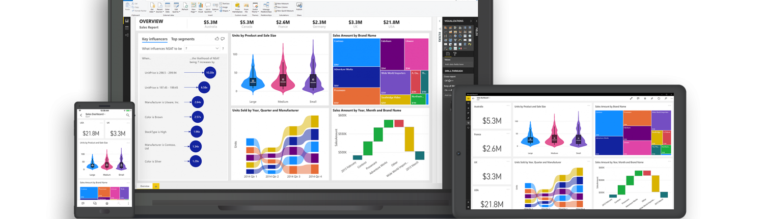
2. Power BI
Microsoft’s Power BI integrates seamlessly with other Microsoft tools, making it ideal for businesses already using the ecosystem.
3. QlikView
Known for its fast processing and in-memory capabilities, QlikView is a favorite among data-heavy industries.
4. Google Data Studio
A free and user-friendly option, perfect for small to medium-sized Australian businesses.
How to Implement Data Visualisation in Your Business
Steps to Get Started
1. Define Your Goals
What decisions are you trying to improve? Start with clear objectives to focus your visualisation efforts.
2. Choose the Right Tools
Pick tools that align with your business size and data complexity.
3. Train Your Team
Ensure your team understands how to use visualisation tools effectively.
4. Integrate with Existing Systems
Connect your data visualisation tools to existing software for seamless operations.
Best Practices for Data Visualisation
Keep It Simple
Avoid cluttered visuals. Focus on clarity and relevance.
Use the Right Charts
- Bar Graphs: Ideal for comparisons.
- Line Charts: Perfect for trends.
- Pie Charts: Best for proportions.
H3: Ensure Data Accuracy
Incorrect data leads to flawed visuals and poor decisions.
Industries Benefiting from Data Visualisation in Australia
H2: A Sector-Wide Impact
1. Retail
Track sales trends and customer preferences to optimise inventory.
2. Healthcare
Analyse patient data to improve treatments and streamline operations.
3. Finance
Spot investment opportunities and manage risks effectively.
4. Education
Enhance student performance tracking and resource allocation.
The Future of Data Visualisation in Australia
The integration of artificial intelligence (AI) with data visualisation promises even greater insights. Imagine tools that not only display data but also predict future trends—this is the future Australian businesses can look forward to.
Common Challenges and Solutions
H3: Challenges
- Overwhelming data volume.
- Lack of expertise in tools.
H3: Solutions
- Invest in training.
- Use AI-driven tools to simplify processes.
Conclusion
Data visualisation is more than just a buzzword; it’s a game-changer for Australian businesses. By turning raw data into actionable insights, it empowers businesses to make informed decisions faster and more effectively. Don’t get left behind—embrace data visualisation and transform your decision-making processes today.
FAQs
1. What is the best data visualisation tool for small businesses?
Google Data Studio is an excellent option for small Australian businesses due to its simplicity and cost-effectiveness.
2. How does data visualisation improve decision-making?
It simplifies complex data, making it easier to interpret and act upon quickly.
3. Can non-technical teams use data visualisation tools?
Yes, many tools are designed to be user-friendly, even for non-technical users.
4. Is data visualisation suitable for all industries?
Absolutely! From retail to healthcare, every industry can benefit from better data insights.
5. What are the key features to look for in a visualisation tool?
Look for user-friendliness, compatibility with existing systems, and robust analytics capabilities.
Also Read
- ► Mitolyn Weight Loss Supplement
- ► Top 10 Sorry Gifts That Say You Care
- ► Why Enrol In SEO Advanced Course Training?
- ► What Are the Best Team Building Activities for Teams?
- ► Interior Plus: Best Interior Design KL & Kuala Lumpur Experts.
- ► RG 59 Cable: A Reliable Solution for Signal Transmission
- ► NeuroQuiet: Enhancing Hearing and Mental Clarity in New York
- ► Everything You Need to Know About MBA Admission 2025 and KM University’s Deadline
- ► Pawbiotix for Pets Gut Health Formula
- ► Hotel Management course in Rawalpindi Islamabad
- ► Top Interior Design Trends in Kuala Lumpur for 2025
- ► Tape Ball or Tennis Ball: How to Pick the Right One for Your Game
- ► Comparing Acrobat Reader and PDF Gear for Efficient PDF Management
- ► When to Use R Over Power BI for Data Projects
- ► Tips for Packing Efficiently with Movers